Today's super quick project originates from a request I got from a friend's friend working at a consultancy: "how do I visualize a dense pairwise similarity matrix in a way that looks nice on my slides?"
Consultants, right? :)
Recipe difficulty:
- Statistics: 🔥 - Zero, zip, nada
- Technical: 🔥 - self-contained code, ready to go!
- Time required: 🕜 - About 10 minutes tops
What it is
Just a short reflection in how to visualize bi-dimensional data.
Why it is useful
Most people can 'easily' understand and visualize up to 2 dimensions, so very often - when visualizing data - you will consciously or unconsciously try to reduce it down to max 2 dimensions. The problem with this approach is that squeezing data into two dimensions tends to make it grow exponentially along X and Y.
Luckily, we have a few ways to go about this:
import pandas as pd
import matplotlib.pyplot as plt
import numpy as np
import seaborn as sns
%matplotlib inline
import warnings
warnings.filterwarnings('ignore')
As usual, I generate some dummy data which looks like a correlation index between stocks.
Correlation is a measure of similarity, so in fact you would be able to apply the same visualizations to plenty of situations where you're trying to do multi-dimensional comparisons between entities. For instance, 'how similar are these friends' if you work at Facebook; 'how interconnected are these web pages' if you work at Google, or 'how do I minimize aggregated risk' if you work at Citadel.
stocks = ['AAPL','GOOG','AMZN','ASML','BIDU','MSFT','CSCO','NVDA','AMD']

np.random.seed(92)
m = np.random.rand(len(stocks),len(stocks))
m_symm = (m + m.T)/2
np.fill_diagonal(m_symm, 1)
correlation_data = pd.DataFrame(m_symm, columns = stocks, index=stocks)

corr_pair_ix = np.array(np.meshgrid(stocks, stocks)).T.reshape(-1,2)
corr_pair_val = [correlation_data[i[0]][i[1]] for i in corr_pair_ix]
correlation_pairs = pd.DataFrame(corr_pair_val, corr_pair_ix,
                                columns = ['ρ']).drop_duplicates(subset='ρ').sort_values(by='ρ',
                                ascending=0)
correlation_pairs = correlation_pairs[correlation_pairs['ρ'] < 1]

correlation_data
| AAPL | GOOG | AMZN | ASML | BIDU | MSFT | CSCO | NVDA | AMD | |
|---|---|---|---|---|---|---|---|---|---|
| AAPL | 1.000000 | 0.863581 | 0.640282 | 0.298960 | 0.262634 | 0.461653 | 0.448928 | 0.656390 | 0.692098 |
| GOOG | 0.863581 | 1.000000 | 0.778203 | 0.332497 | 0.724867 | 0.374351 | 0.244491 | 0.498331 | 0.423516 |
| AMZN | 0.640282 | 0.778203 | 1.000000 | 0.526299 | 0.447576 | 0.655979 | 0.745490 | 0.846636 | 0.647947 |
| ASML | 0.298960 | 0.332497 | 0.526299 | 1.000000 | 0.492436 | 0.619196 | 0.068567 | 0.561173 | 0.537642 |
| BIDU | 0.262634 | 0.724867 | 0.447576 | 0.492436 | 1.000000 | 0.335769 | 0.544753 | 0.409941 | 0.282812 |
| MSFT | 0.461653 | 0.374351 | 0.655979 | 0.619196 | 0.335769 | 1.000000 | 0.475377 | 0.630767 | 0.510046 |
| CSCO | 0.448928 | 0.244491 | 0.745490 | 0.068567 | 0.544753 | 0.475377 | 1.000000 | 0.268824 | 0.676306 |
| NVDA | 0.656390 | 0.498331 | 0.846636 | 0.561173 | 0.409941 | 0.630767 | 0.268824 | 1.000000 | 0.717492 |
| AMD | 0.692098 | 0.423516 | 0.647947 | 0.537642 | 0.282812 | 0.510046 | 0.676306 | 0.717492 | 1.000000 |
The consultant who started this whole post wanted to visualize things 'as a network', with the edge length proportional to the similarity.
While that sounds like a good idea, it's actually unsolvable analytically: in order to match the edge length with the similarity you'd need each network loop to conform to the triangle rule: for each triplet of nodes A, B and C; the sum of any two edges A+B must be > C
We can trivially note, in the example above, that the triplet ASML, GOOG and AAPL does not conform to this rule. This means a solution is not guaranteed for this problem.
Luckily, we can still relax the network using an algorithm such as Fruchterman-Reingold. In the dataviz world such graph is called a Force Directed graph.
import networkx as nx
network = nx.from_pandas_adjacency(correlation_data)
node_position = nx.spring_layout(network, seed=42, iterations=200)
def draw_network(network, node_position):
    labels_position = {}
    for k, v in node_position.items():
        labels_position[k] = (v[0], v[1]+.2)

    edge_weights = [correlation_data[edge[0]][edge[1]]*2.5 for edge in np.array(network.edges)]

    fig = plt.figure(figsize=(15,7))
    nx.draw_networkx_nodes(network, node_position, node_shape='o', alpha=.4)
    nx.draw_networkx_edges(network, node_position, width=edge_weights,
                           edge_color=edge_weights, edge_cmap=plt.cm.Blues)
    nx.draw_networkx_labels(network, labels_position, font_color='#888899', font_size=14)
    plt.box(on=None)
    ylim, xlim = plt.gca().get_ylim(), plt.gca().get_xlim()
    plt.ylim(ylim[0]-.5, ylim[1]+.5)
    plt.xlim(xlim[0]-.5, xlim[1]+.5)
    plt.axes().set_aspect('equal', 'datalim')
    plt.axes().grid(False)
    plt.show()
draw_network(network, node_position)
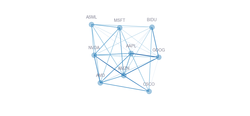
While force directed graph look quite cool (especially when they are interactive!), and are 'something else' when seen in a slides deck (you can't make those in Excel...), i personally find their information density way too low - and they are far too difficult for the human brain to parse.
They are the pie chart of advanced dataviz: form over function.
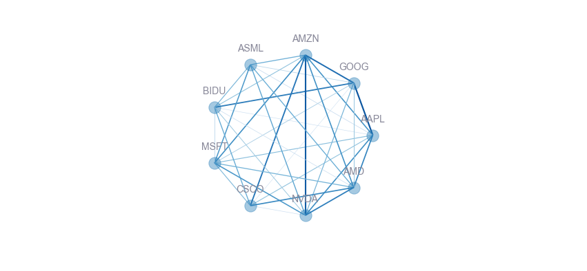
Now look at a simple change we can make: let's arrange all nodes symmetrically (in a circle) using basic trigonometry. We can use opacity, edge width or colors (or all, in this case) to highligh similarity in an intuitive manner.
The graph is pleasing to the eye, but also makes it clear that AMZN-GOOG, AAPL-GOOG, AMZN-NVDA and NVDA-AMD are amongst the most similar stocks. It is, however, still quite awkward to read, and becomes hard to interpret at a glance as the number of connections increase.
node_position_circle = {}

radius = 1
step = (2*np.math.pi/len(node_position))
for i, (k,v) in enumerate(node_position.items()):
    node_position_circle[k] = (radius*np.math.cos(step*i),
                               radius*np.math.sin(step*i))

draw_network(network, node_position_circle)
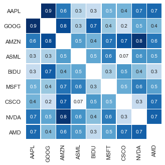
I think we can still do better. For this, a heatmap with annotations looks quite neat, and carries a 1:1 information density ratio with regards to the original dataset. It scales pretty well to hundreds of items, and keeps the accuracy and precision of our analysis while being interpretable at a glance.
Needless to say, I absolutely love heatmaps.
plt.figure(figsize=(10,5))
ax = sns.heatmap(correlation_data.replace(1, np.NaN), linewidths=.5, cbar=False,
                 cmap='Blues', square=True, annot=True, fmt='.1g')
plt.show()
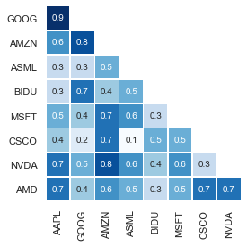
Well, actually - due to the fact that similarity matrices are symmetric (the underlying graph is undirected), we can approximately double the information density by discarding all data north of the diagonal, like this:
plt.figure(figsize=(9,4))
ax = sns.heatmap(correlation_data.where(
                 np.invert(np.triu(np.ones(correlation_data.shape)).astype(np.bool))
                 ).iloc[1:,:-1].round(1),
                 linewidths=.5, cbar=False, cmap='Blues',
                 square=True, annot=True, fmt='.1g')
plt.show()
However, in the end the most important question is: what is the target audience of your visualization, and what do they want to get out of it?
It's easy to get all excited about the work you did and wanting to show your boss/CEO/whatever that you produced lots of results.
The reality is that's not what you're usually paid for. What is required of you is usually the ability to distill down complex information to actionable choices. In this particular case, it's conceivable that your boss is only interested in the most similar and dissimilar stocks, to make rapid and informed decisions about, say, the company's market strategy.
And for that, nothing beats a dot- or barchart.
f, ax = plt.subplots(figsize=(6, 4))
sns.stripplot(x="ρ", y='index',
            data=correlation_pairs.reset_index().head(5).append(
            correlation_pairs.reset_index().tail(5)),
            color='b',palette="ch:s=1,r=-.5,h=1_r", size=10)
ax.set(xlim=(0, 1), ylabel="", xlabel="Top and bottom 5 stock correlations")
sns.despine(left=True, bottom=True)
ax.xaxis.grid(False)
ax.yaxis.grid(True)
plt.show()
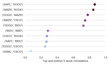
Function over form, always.